Congruence: What is it and why should you care?
With examples from Wells Fargo and another Fortune 500 card issuer
TL;DR - Aligning your messaging from your ad, to your landing page, to your final conversion steps creates lift in your marketing funnel, reducing your CACs and increasing your customer acquisition volumes. It sounds elementary. Yet many organizations forget to do it.
In a recent Podcast, Alex Hormozi explains Congruence, and why it matters:
One of the easiest uplifts that we can create is following the click journey, which is following the path from prospect to customer. And as crazy as this sounds, you probably haven't done yours in six months or more. And the crazy thing is, is that you've changed like three or four things in that process during that time period, but you haven't looked at how different it is for the prospect.
And although you may have improved some things, you're still leaving money on the table. The big word for this is Congruence. […]
You can always increase how much money you make by making everything from the beginning to the end congruent. One of the issues with businesses is that you have handoffs between departments, handoffs between employees, handoffs between platforms and technology. And so there's many transition points for a prospect to become a customer and even a customer to become a repeat purchaser.
-Alex Hormozi
Let’s make this concrete for a bank marketer.
Wells Fargo’s Flow From NerdWallet
Let’s look at Wells Fargo’s Active Cash®️ Card.
Here’s how NerdWallet, one of Wells Fargo’s affiliate partners, promotes the product:
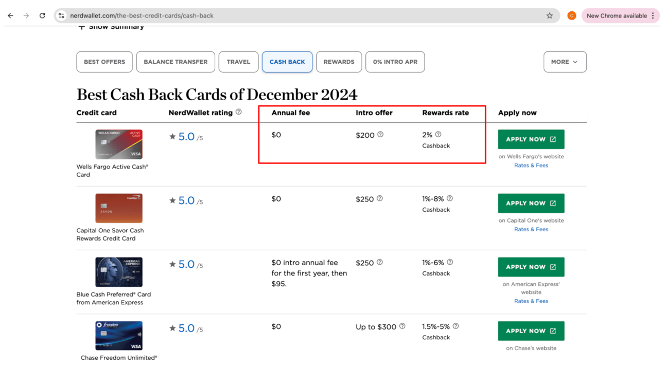
You’ll notice 3 key selling points: the $0 annual fee, a $200 introductory bonus, and a 2% Cashback rewards rate. All 3 are clear to the customer.
When the customer clicks on the green “APPLY NOW” button, the customer sees:
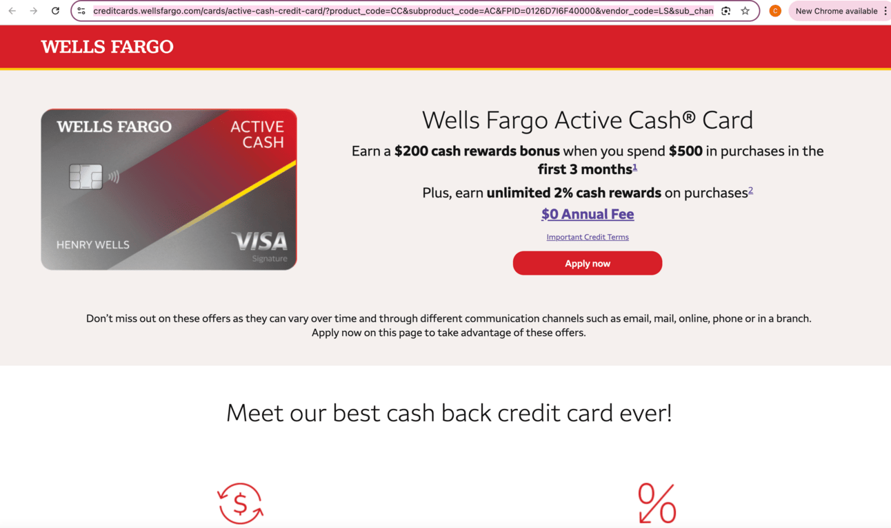
You’ll notice Wells Fargo has the 3 key selling points in bold or underlined. So there’s a good deal of Congruence here.
What could make it better?
Put the benefits in the same order NerdWallet has them: annual fee, intro bonus, rewards rate
Show the information in a similar visual presentation to the NerdWallet page
Cobrand the landing page with NerdWallet’s logo
De-emphasize some of the other details so the 3 key selling points stand out
With all that said, Well Fargo’s landing page is reasonably Congruent to the NerdWallet listing page. A solid 8 out of 10 in my book.
The next Fortune 500 issuer scored a 3 out of 10.
Let’s unpack what I observed.
Discover’s Flow From NerdWallet
Let’s look at a different example.
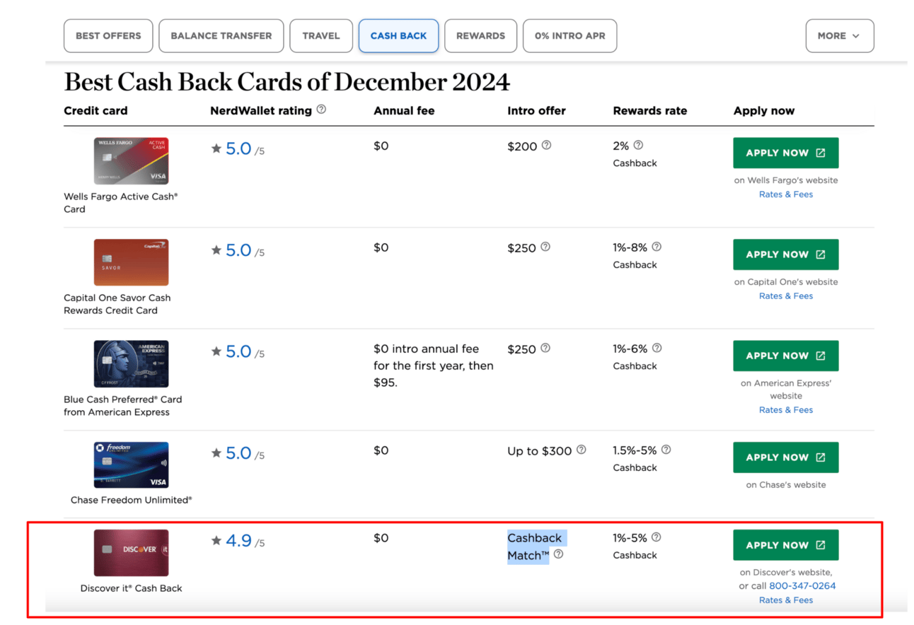
This one again from NerdWallet.
Let’s look at the Discover it®️ card. It has a $0 annual fee, a “Cashback Match™” intro bonus, and a 1%-5% Cashback rewards rate displayed clearly on the listing page.
Clicking out from NerdWallet, the customer sees the following from Discover:
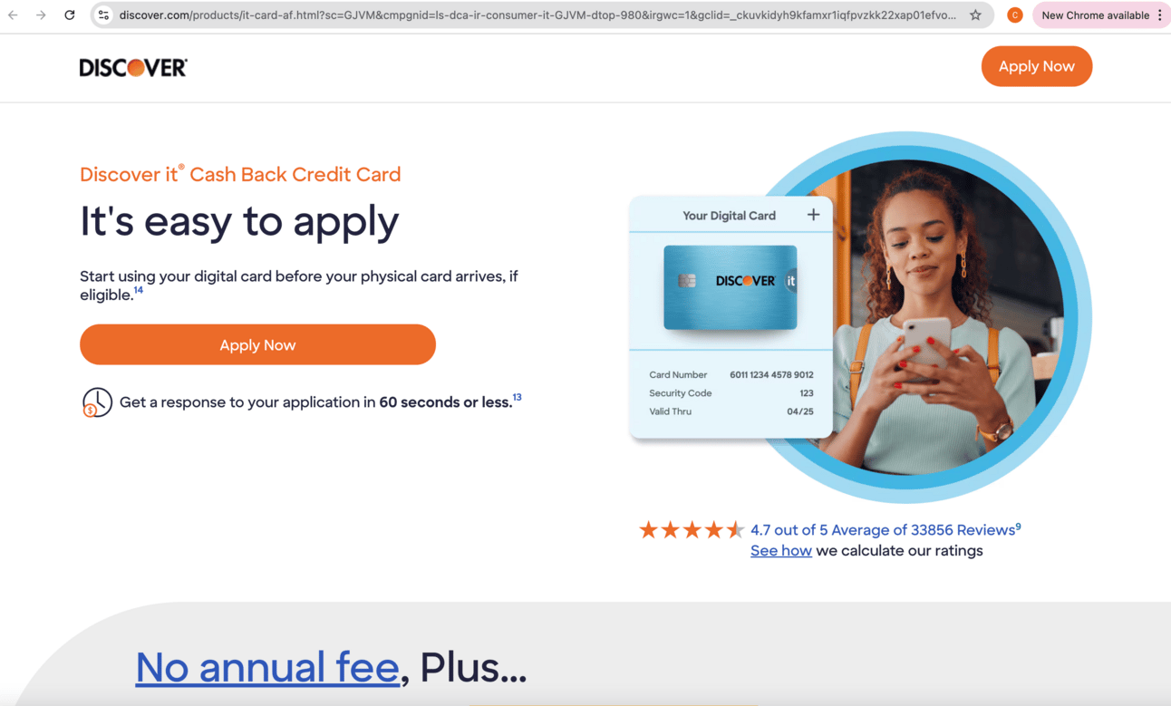
Notice how the 3 key selling points I saw on NerdWallet — the $0 annual fee, the “Cashback Match™” intro bonus, and the 1%-5% Cashback — aren’t present.
On the bottom of the screen, I see a mention of “No annual fee”, but I don’t see the Cashback Match™ and the 1%-5% rewards benefits I saw on NerdWallet.
Scrolling further down the page, I see:
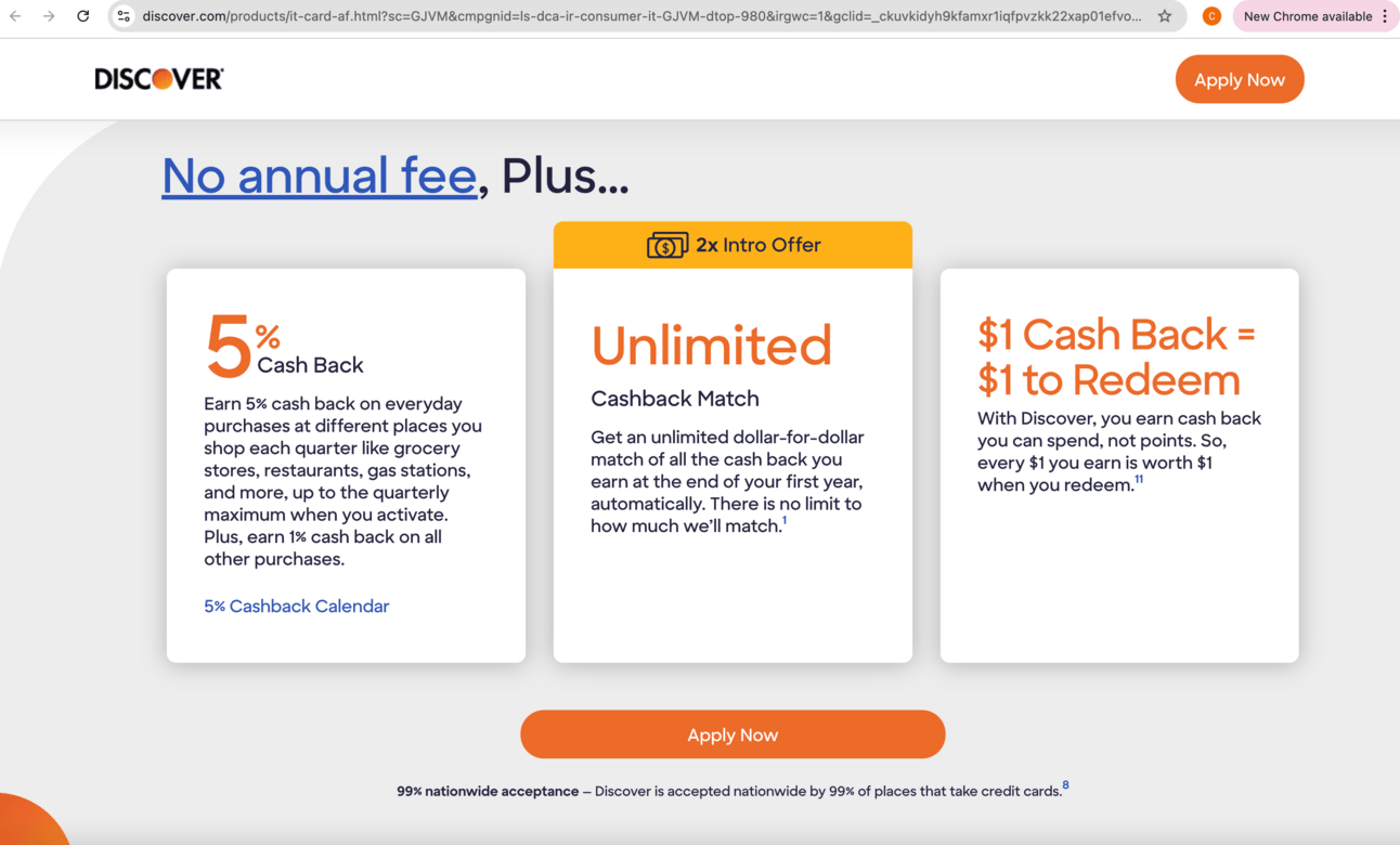
Now, I see all 3 key selling points on one page, but presented differently than what I saw on NerdWallet.
Let's get anal and compare how the selling points are communicated:
NerdWallet
Discover
Annual Fee
$0
No annual fee
Intro bonus
Cashback Match™
Unlimited Cashback Match™
Rewards rate
1%-5%
5% (with a paragraph explaining what gets 1%)
Discover also presented the selling points in a different order than NerdWallet.
NerdWallet’s sequence: annual fee → bonus → rewards rate
Discover’s sequence: annual fee → rewards rate → bonus
I give this a Congruence score of 3/10. That’s because the landing page (a) put the 3 key selling points below the fold, (b) described the selling points differently, and (c) changed the order of the selling points.
Simply getting all the info above the fold would have improved this to a 6/10.
More Congruence, Higher Conversion
That’s the bottom line.
When your pitch is consistent across the steps of the funnel, customers continue. When it’s not, customers get confused and leave.
Not rocket science.
In a lending business I worked on, we showed dynamic APRs on one of our partner’s websites. Sometimes those APRs mapped exactly to the APRs we displayed on our landing pages. And sometimes they didn’t.
When the APRs matched exactly, we got a 20+% pop on our conversion rates.
So guess what?
We got pretty obsessive about making sure the APRs matched across all segments, channels, and product types.
Conceptually hard work?
Of course not.
But in practice, doing it well took months of effort and coordination across various internal teams.
Ways to improve your Congruence
Identify the key selling points of your offer (what MUST the customer know to transact)
Reinforce key selling points using the same words and numbers (and visual display, if possible) across your funnel
Keep your key selling points above the fold
Optimize for both desktop and mobile
Recognize that your landing pages will vary across channels and distribution partners
Commit to re-assessing Congruence at least quarterly
Congruence isn’t the sexy, shiny object stuff that your CEO or board members will get excited about. But, it could be low-hanging fruit that can knock 10% to 20% off your CAC and increase your acquisition volumes by the same.
When your message is clear, aligned, and reinforced at every customer touchpoint, you win.
The Free Toaster is a newsletter for marketers at banks and lenders. We deliver news, data, and insights (like this piece) to help you acquire more customers. Sign up to get it shipped weekly to your inbox.


